Page 2
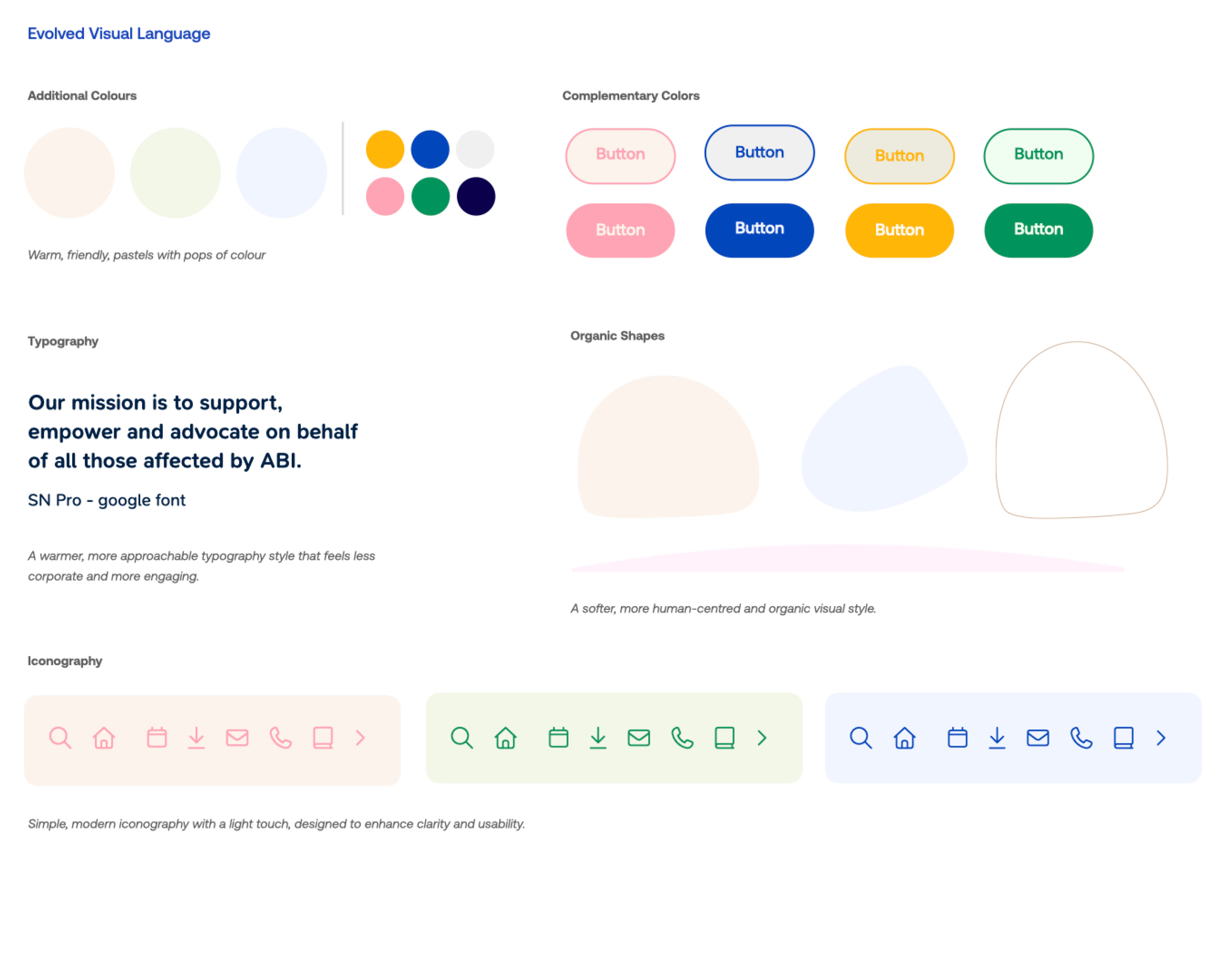
Overall, the aim is to make the website feel warmer, more accessible, and more approachable. The visual direction should move away from anything overly clinical or institutional, and instead create a welcoming experience that feels human, supportive, and easy to navigate.
The evolved visual language combines approachable imagery, clear typography, accessible colour palettes, and thoughtful use of space to ensure content is easy to navigate and understand for a diverse audience, including individuals living with brain injury, carers, families, health professionals, and community partners.
This moodboard serves as a foundation for the website's visual identity and user experience, helping establish a digital presence that reflects the positive impact Brain Injury Matters has within the community.
The look and feel should help users feel reassured from the moment they arrive on the site, whether they are living with a brain injury, caring for someone, making a referral, or looking to support the organisation.